
Overview
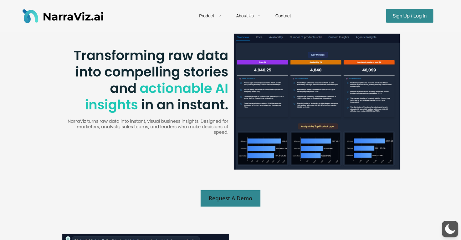
NarraViz.ai is an AI-driven platform that transforms raw data into instant, visual business insights, creating 'data stories' that are easy for decision-makers to interpret.The tool is designed with marketers, analysts, sales teams, and leaders in mind, enabling fast and informed decision-making. With its built-in NarraterAI, NarraViz delivers conversational insight by simply asking it a question, thereby eliminating the need for complex dashboards or extensive data mining.It also provides a deep understanding of the reasons behind the numbers. Another significant feature, NarraSense, transforms dense, fragmented datasets into clear, narrative-driven insights, without unnecessary clutter or manual searching.This AI-powered tool also provides adaptive visualization, automatically suggesting the most effective chart type (line, bar, pie, heatmap, etc.) for the given data, eliminating guesswork.Moreover, NarraViz offers a data prep layer that automatically interprets raw data using a human-in-the-loop-method, ensuring data integrity and security.Users can sign up to connect their data to the platform and the AI provides actionable insights. The information can be conveniently exported and shared as PDF reports or via a link.
Pros and Cons
Pros
- Handles multiple data forms
- Provides data-based insights
- Dashboard export features
- Features natural language processing
- Minimum technical expertise required
- Benchmarking and trend analysis
Cons
- No mobile app
- Limited data formats
- No real-time analysis
- No API
- Only exports as PDF
- Limited chart types
Categories
- Primary: Work
- Secondary: Business
- Specialty: Data
Community Feedback
Only the latest comments are shown.UI Experience is fast & good with free account limited data (100 csv records) but no 3rd party integrations and limited data connectionand no 3D /funnel many more chart visualizations are missing.
I felt there is need of more ready made templates. But, it does what it claims. I chose one question suggested by the AI agent, and it created the infographics in few seconds. It's cool. Saving it for future reference.
I was just trying to get a quick graph showing population evolution over the last 30 years, didnt have the dataset ready, so I was hoping the tool could auto-fill something reasonable. But it literally gave me three values. Three?? For 30 years?? What kind of trend can I possibly see with that? If the tool offers to research the data, it should at least offer a full timeline. And when I pasted the data I found, it created a literally bar chart???