
Overview
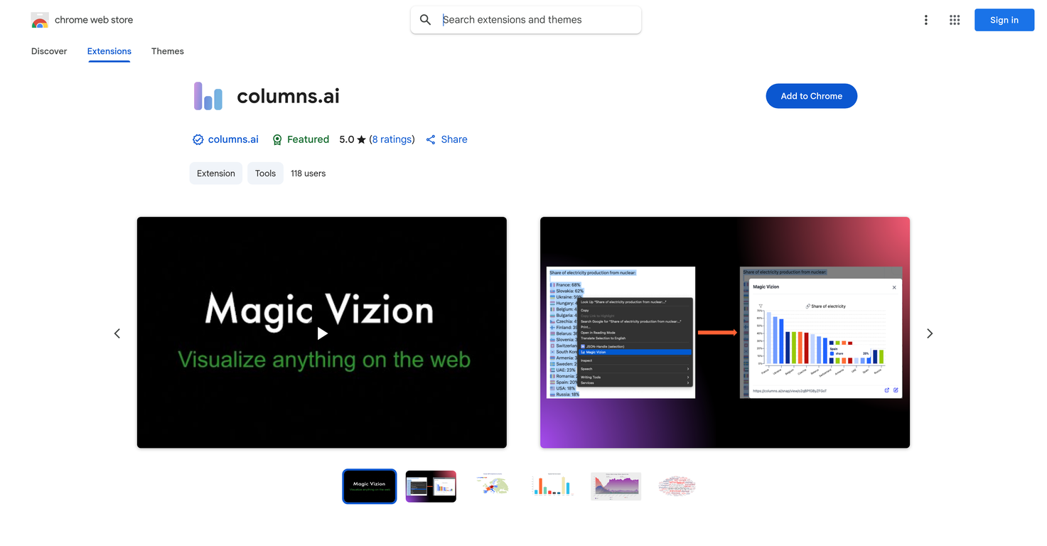
Columns.ai is an intelligent tool used to create instant and interactive data visualizations, primarily used as a Chrome extension. The tool processes any selected web content, such as text, tables, or paragraphs, and transforms it into a clear, dynamic visual representation.The visual can be opened in a new tab for customizing, saving, or sharing. Implementation of this tool is simple and requires the user to install the extension on Chrome.The next step is highlighting any web page parts of interest. After highlighting, the user ensures the extension generates a visualization by right-clicking and selecting the 'Magic Vizion' option.This visual analysis tool is beneficial for researchers, analysts, students, or anyone interested in turning information into insightful visual data. Any concerns, questions, or feedback can be directed to the support team through their email.The interactions between the consumers and the tool are governed by a privacy policy detailing data usage and collection.
Pros and Cons
Pros
- Transforms web content into visuals
- Interactive data visualization
- Simple Chrome extension
- 'Magic Vizion' feature
- Customizable generated visuals
- Shareable visualizations
Cons
- Google Chrome exclusive
- No mention of offline use
- Limited to web content
- Requires manual content selection
- No API for integration
- Visual customization may be limited
Categories
- Primary: Work
- Secondary: Business
- Specialty: Data
Community Feedback
Only the latest comments are shown.UI Experience is fast & good with free account limited data (100 csv records) but no 3rd party integrations and limited data connectionand no 3D /funnel many more chart visualizations are missing.
I felt there is need of more ready made templates. But, it does what it claims. I chose one question suggested by the AI agent, and it created the infographics in few seconds. It's cool. Saving it for future reference.
I was just trying to get a quick graph showing population evolution over the last 30 years, didnt have the dataset ready, so I was hoping the tool could auto-fill something reasonable. But it literally gave me three values. Three?? For 30 years?? What kind of trend can I possibly see with that? If the tool offers to research the data, it should at least offer a full timeline. And when I pasted the data I found, it created a literally bar chart???